info
/
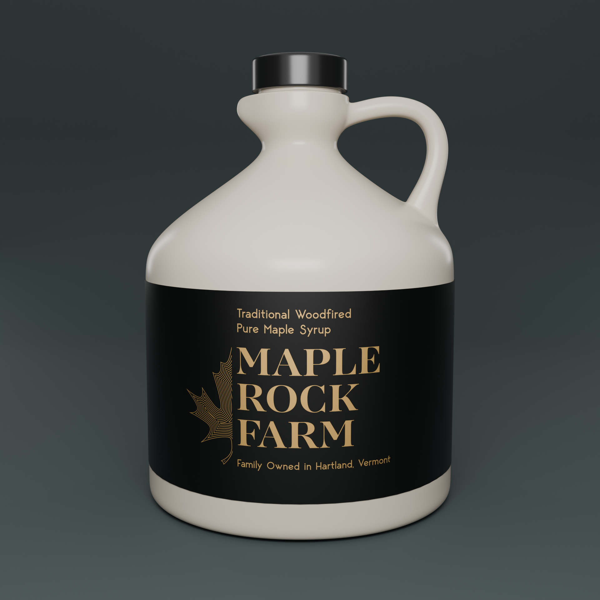
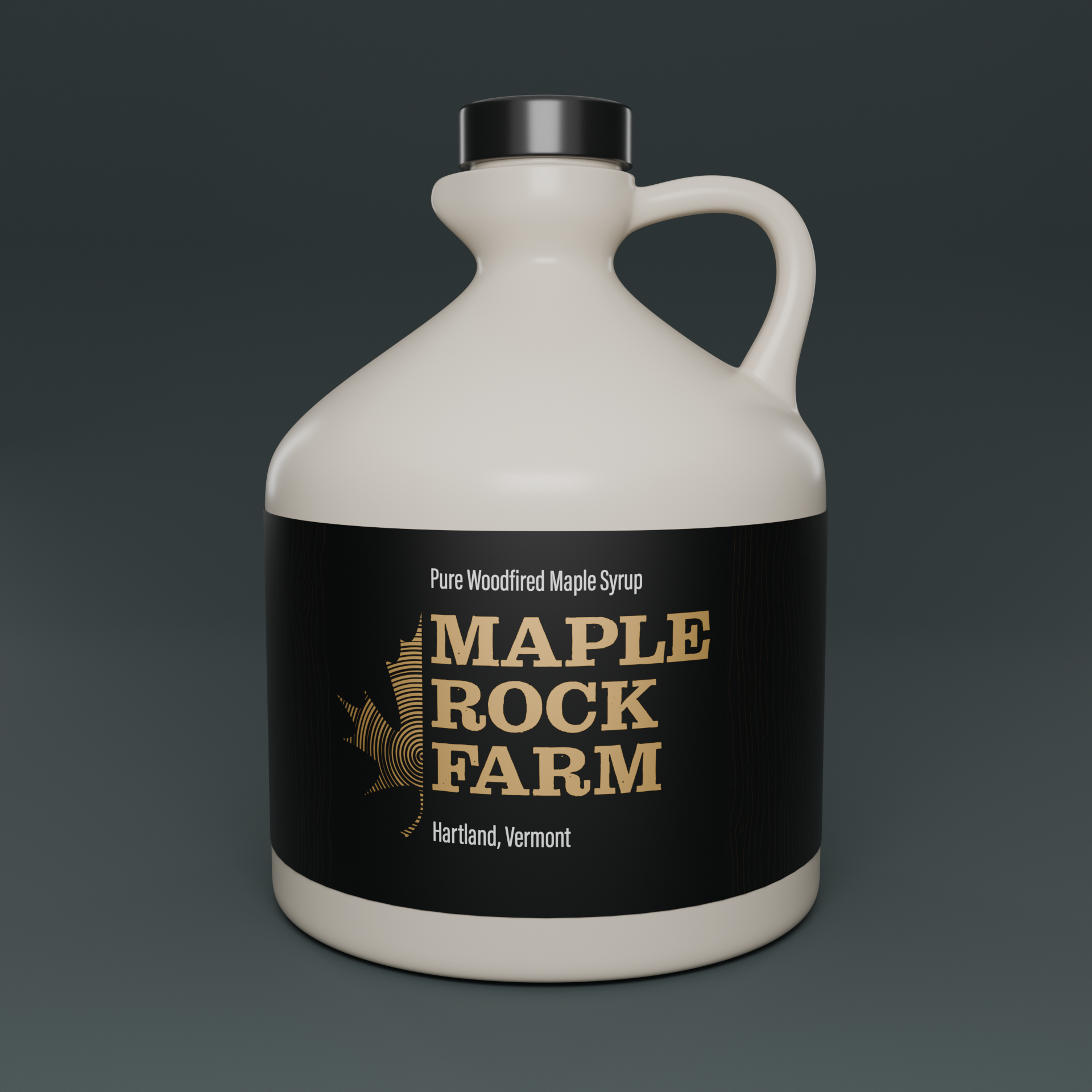
A syrup label project that boiled over into a full rebrand. The client provided the original logo used to mark the generic Vermont Maple Syrup bottles. The original scope of the project was to create a new bespoke label for the farm as they would be expanding into additional local markets. The client was tied to the original concept of growth ring and wanted to elevate the brand while maintaining the local grounded charm.
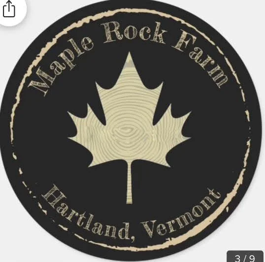
The original logo concept provided by the client
Lorem Ipsum about the
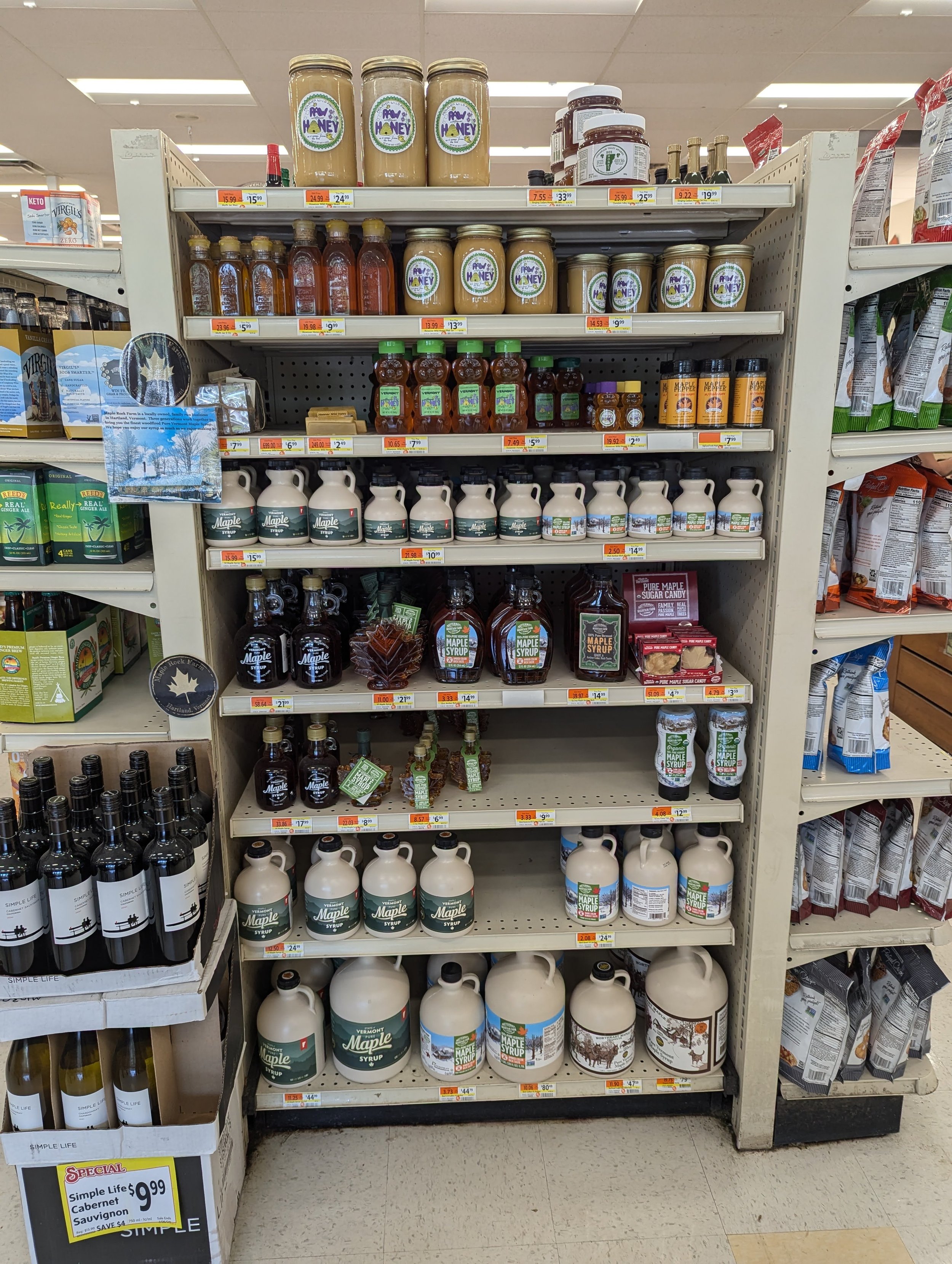
Some local “market” research